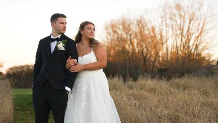
Colour matching your reels to the film is what separates a grid that reads as one studio from a grid that reads as a folder of loose clips. Every piece in the set can be graded well and the set can still fail, because what somebody scrolling your profile picks up on isn’t any individual reel. It’s whether the whole run looks like it came from one hand.
Why colour matching reels to your wedding film matters
Films get watched once, on their own. Reels get watched in a row, side by side, on a grid. That context exposes inconsistency the way nothing inside a single film ever does. Put a warm reel beside a cool one beside a flat one and a viewer sees three different studios, however good each of them happens to be by itself.
It registers with the couple too. When a reel doesn’t look like the film you showed them, the implication is that the film was a one-off rather than your normal standard.
Start from the film, not from the reel
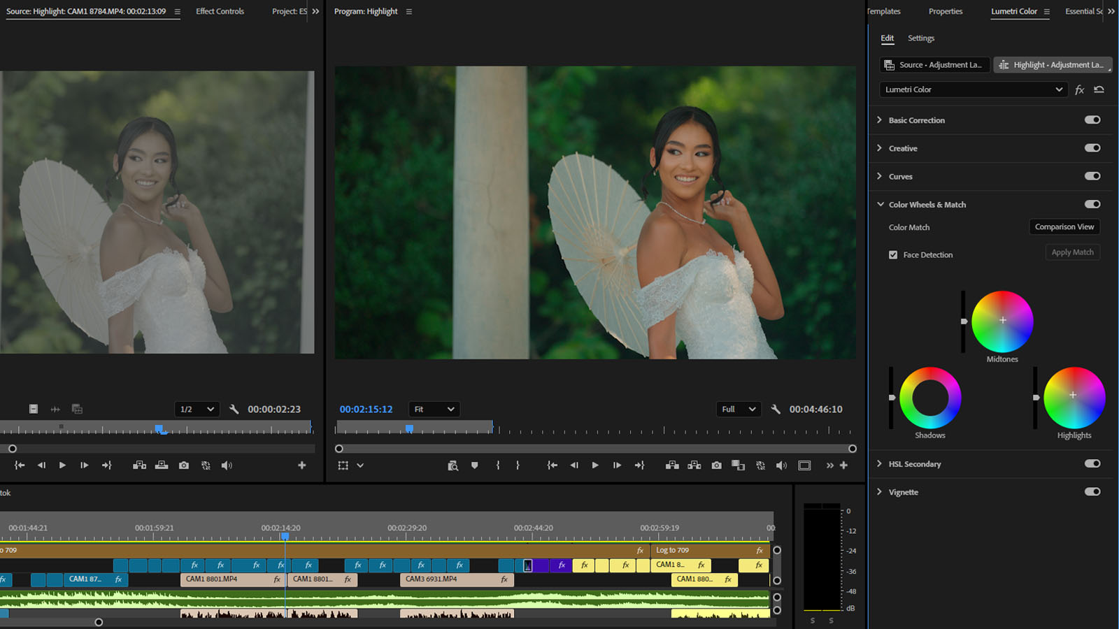
Your film is the reference. Grade it first, lock the look, then pull the reels toward it. Never the reverse. The simplest working method is to pull a still off the finished film and keep it up on screen the whole time you’re grading the vertical pieces. It’s what stops them creeping warm or contrasty across an afternoon of small adjustments nobody notices individually.
Matching mixed sources
When your reels include footage shot separately for vertical, off a second body or a different profile or sometimes a phone, those sources won’t agree with each other natively. Match them to the main camera before you apply any look at all, and check skin tones on the scopes instead of trusting your eye. Two clips that look close enough on a laptop will cut badly against each other on a phone. We work through the trade-offs between the two sources in reels from a wedding film vs shot for reels.
Build the look once
Save the film’s grade as a preset or an adjustment layer, drop it across every reel from that wedding as your starting point, then correct each clip underneath it. Faster than grading every piece from scratch, and more to the point, repeatable. You can carry the same look into the next wedding, and that’s what turns a grade into a house style. We make the wider argument in building a house style for your wedding films.
Grading for a small, bright screen
Reels get watched on phones, often outside, often at half brightness. A grade that’s subtle and lovely on a calibrated display can turn muddy in those conditions. A bit more contrast and a bit more separation through the mid-tones tends to survive the trip better. You’re not building a different look, just one that holds up somewhere worse. Check every reel on a phone before it ships.
What not to do
Don’t reach for a platform filter, and don’t grade your reels toward whatever look happens to be going around. Both undo the consistency you’ve been working for, and both age badly within a year. The look belongs to the studio and should hold steady across the film and everything pulled out of it, which is the standard we describe in what makes a wedding film look cinematic.
Keeping it consistent at volume
Over a season the thing to watch for is drift, a look shifting slowly from wedding to wedding until the grid stops holding together. Cutting the reels alongside the film against the same reference is what prevents that, and it’s how our wedding reels editing is built. It’s all graded in Adobe Premiere Pro and delivered ready to post under your own brand.
Looking for a post-production partner?
We edit cinematic wedding films for filmmakers and studios — graded, paced, delivered in ten days, under your brand.